Creating a color palette is one of the most challenging aspects of D.I.Y. design. While there is no right or wrong approach I thought I’d share a few tips from the pros to help spur the creative process along.
Take a design tip from Mother Nature
Artists often find inspiration in their natural surroundings. Look to flower gardens, bird feathers, even stones on the beach, for colors that coordinate naturally.
Natural elements also introduce texture, another source of design inspiration. Think birch bark and your mind goes to the colors and textures associated with these papery trees. Sometimes you just need to get out the office and take a walk in the woods. Pick up bits and pieces along the way that inspire you. Then get our your scanner. You’d be amazed what I’ve run through my flatbed scanner. Leaves, hand-blown glass perfume bottles, a charm bracelet, you name it.
Draw Inspiration from the Masters

Impressionist artists like Van Gogh were masters of color, often blending several to get the look of one.
Artists throughout history studied color theory and light. Monet’s soft pastel water gardens, Mondrian’s bold linear color compositions and who can forget Warhol’s pop art? Why reinvent the Mona Lisa? Pull color combinations from your favorite artist’s work.
You don’t need to be an art historian to know what you like. From soft and subtle earth tones of the Renaissance to the bold fields of color in modern art, there’s limitless inspiration in studying the masters.
Color Trend through Time
Different periods and perspectives in art often shared similar colors as well. So if you love art deco, you’ll probably like the colors of that era.
Compare the psychedelic colors of the ’70s to the preppy ’80s. Color trends of the times will translate into all realms of consumerism. From fashion to architecture to album covers and t-shirts. Our past is a great resource for design inspiration. So don’t be shy. Pull out your Pink Floyd albums, sort through high school photographs and memorabilia and see if you can’t find some nostalgia that plucks a colorful chord.
Compare, copy or contrast
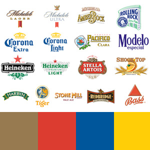
Take a look at businesses or products already on the market; especially Nationally known brands. You may notice color trends within your industry. Now look at your project and decide if you want to align yourself or distance yourself from the competition. Choose your palette according to the response you hope to achieve.
Take these beer logos for example. This is but a small selection of Nationally known brands. And yet it’s easy to spot some common color choices. Is this the result of shared marketing strategists or ad agencies. Not likely. But they all have one thing in common. They sell beer. And perhaps their big-bucks ad agencies have done the research to indicate which colors appeal to the beer drinkers of the world. Now it’s up to you to decide. Go with what works, or buck the system.
The truth is, when it comes to creating a color palette for your next product or ad campaign there is no one answer. So have a little fun. Dive in and get your hands dirty (take a walk), consult your design experts (flip through some art history books) and do a little market research (browse the shelves of a grocery store if you have to), then take the color wheel for a spin.
Color inspiration resources
Colour Lovers: millions of color palettes at your disposal
Polyvore: fashion inspired colors (as seen in the 80s image above)
Color Palette Generator: upload your own image and create color palettes automatically


I like your writing style…fun!